
HOW I MAKE A COMIC BOOK PAGE!
Comic Book Practice, Part One
No Regrets
Comic Book Practice, Part Two
Becoming
Comic Book Practice, Part Three
The Flames
Comic Book Practice, Part Four
Arising
Comic Book Practice, Part Five
Absorbing
Comic Book Practice, Part Six
Inspiring
Sam Battin here. You got to practice. You just got to. I know I do. I was reading Bakuman and Saiko mentioned that he practiced by copying 100 pages from the best battle manga. This got me to thinking, that copying is legitimate if it's to build your skills. If you're putting out a copy as your own work, then you're a dope and a liar, but if I want to be the best then I have to practice.
So I figured that it might be interesting if I documented the process of how I went about making a comic book page. I'd see what worked, if anything, and what didn't, and I might possibly improve my skills.
Step One: Getting Started
THe first thing I had to do was clean off my drawing board. I'd been throwing crap on it since Halloween (it's December 2013 as I write this):
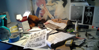
|
So that's out of the way. I've been using this drawing board since 1999. My workspace could be made more efficient by getting one of those things you hang on the side of it to store pens and crap like that. I should get one of those.
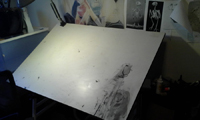
|
Step Two: Doing the Pencils
I use a technical pencil because it's much easier than sharpening your pencil every five minutes like a jerk.
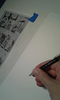
|
I draw all of the panel borders first. This will tell me how big each panel is in relation to each other. Also this is really easy so I can space out while I do this. It's like a warmup.
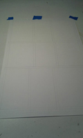
|
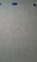
And so the pencils are done. At this point I'm feeling pretty good because I like pencilling. I "corrected" some of the initial artists' mistakes. Whoever it was sometimes rushed the hands and made them a little small. Also I made the female character more authentically asian. She's supposed to be from "East Undia". This comic was written in 1946. It was weird because I was trying to draw a really hot girl but she was dressed like my grandmother.
|
Step Three: Doing the Inks
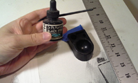
I don't like inking, but it's necessary because I don't have a slave who I can make do the inks. So if I'm gonna be the best, I have to learn how to ink. My supplies were a bottle of Dr. P.H. Martin's ink I had lying around that I hadn't used in I think one or two years. Also I had a #2 brush and a slightly rusted #102 pen nib. My inkwell is from a nosehair trimmer; I attach it to the drawing board with blue painter's tape.
|
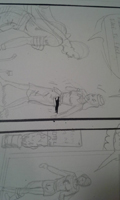
This is what I don't like about inking. It's brutal and I can't click CTRL+Z to undo anything. I think what happened was that a bit of ink dried on the edge of the ruler, and then the speedball caught on the edge, creating a splatter. Gotta remember to keep these rulers clean.
 |
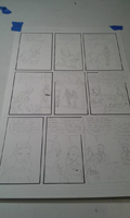
I like inking the panel borders first. It's a warm-up and gets me used to the feeling of the ink. I use a straight-edge and a speedball nib.
 click to enlarge |
Okay then the next step is to draw in the borders for all the word balloons. This is another easy task that helps me get used to the ink. Also I decided to use a crow-quill nib to ink the bottom right panel. Still feeling sort of okay, even though those two fuck-ups with the ink are still staring at me. I'll use the white out later.
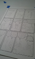 click to enlarge |
I was able to ink the top three panels in an hour. I used the #2 brush on those. Getting the character's hair right was important, so I tried to copy the brush strokes as well as I could. I had the feeling that the original artist used a brush.
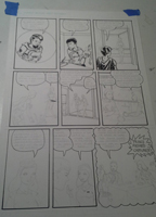 click to enlarge |
The next three panels I was able to get in another hour. Being able to draw figures really small is quite helpful and I'm not great at it. Nor am I great at making very fine lines with the brush. Also I like this style; it's very simple and keeps the plot moving. Small details fill out the scene, e.g. the mirrors, the plants, the signs.
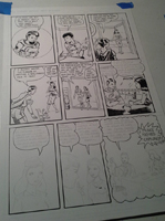 click to enlarge |
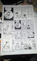
And so the inking of the page is mostly finished. I did feel a sense of accomplishment at this point. Being able to put solid blacks into a page is a skill I need to learn. This guy knew how to do it. Also I gotta say I like how he's having his monkey lick the envelope in panel two. That's funny.
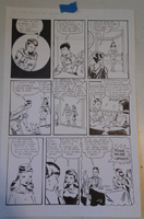 click to enlarge |
Step Four: Post-Production
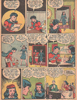
If this were 1946 I'd give the page to the colorist's and I'd be done with it, but luckily I live in the computer age. I took the finished 11x17 inch page to Office Depot and I resized it to 8.5x11 inches. This will allow me to scan the art and correct the fuck-ups and add colors (which I've never done before). At this point I had a respect for the original artist. It took me a week to get this done, working about four hours total across seven days. The original artist probably had to do twenty of these pages every month. Man. Whoever you are, you did great.
 click to enlarge |
I used photoshop to add the colors and correct the fuck-ups. In this picture you see the original version. I used very saturated colors in my first go, but I ended up not liking it. It made it too garish, and strangely, hard to read.
 click to enlarge |
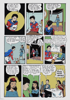
And so this is the final version. I de-saturated the colors and I think this worked better.
 click to enlarge |
 click to enlarge |
This version is closer to full-size: http://www.comics-for-grownups.com/img/making-a-comic-book-page-14.jpg
Step Five: Recriminations
So what I learned was that inking is not so easy, even when you're copying someone. If I had to do things differently, I'd have used a nib instead of a pen. I used a nib for panel seven and I felt more under control. Also I need more light; it was hard to see when I was dipping my brush in the ink and I'd often come away with too much ink on the brush. It's the small details that matter and there's a great deal I need to learn about inking.
On the bright side, learning about colors was pretty neat. My intention was to try to use the four-color palette that they must have used back then, but today's technology gives me way more choices and possibilities. Oh yeah, I also found this for the flesh and hair colors: http://www.retouchpro.com/forums/html.php?file=bbcolorcharts.html. There were palettes I could install into photoshop. I liked how I came to the insight that bright, saturated colors aren't the only choice, even if it seems "right".
NEXT: Read Part Two of Comic Book Practice

